For this project, I wanted to go back to what got me into design in the first place: concert posters.
I chose the Austin Reggae Fest because I am a huge reggae fan and wanted to do something
different than the punk concert posters that I’ve done in the past.
different than the punk concert posters that I’ve done in the past.
The type is all hand done in Adobe Illustrator. The background images are old reggae albums assembled into a collage.
It gives the feeling of old concert posters that have been layered on top of each other.
It gives the feeling of old concert posters that have been layered on top of each other.
I chose a lineup that I’d love to see and went from there.
Since the three bands I chose to headline the Austin Reggae Fest were popular in the 70s, I thought I would do a throwback/vintage design to capture that feeling.
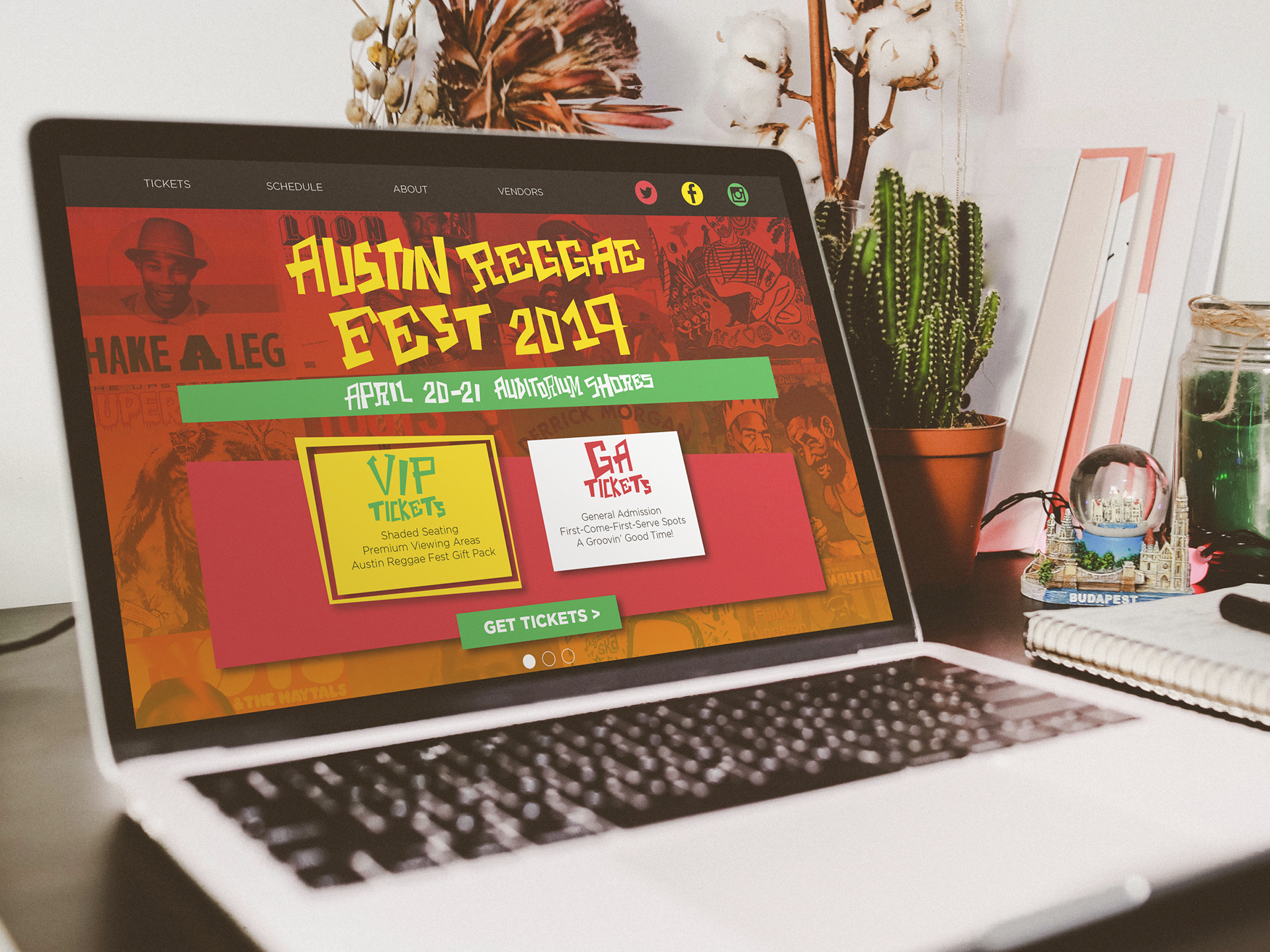

After making the poster for the event, I wanted to take it further and design a landing page where people could learn more about Austin Reggae Fest and purchase tickets.
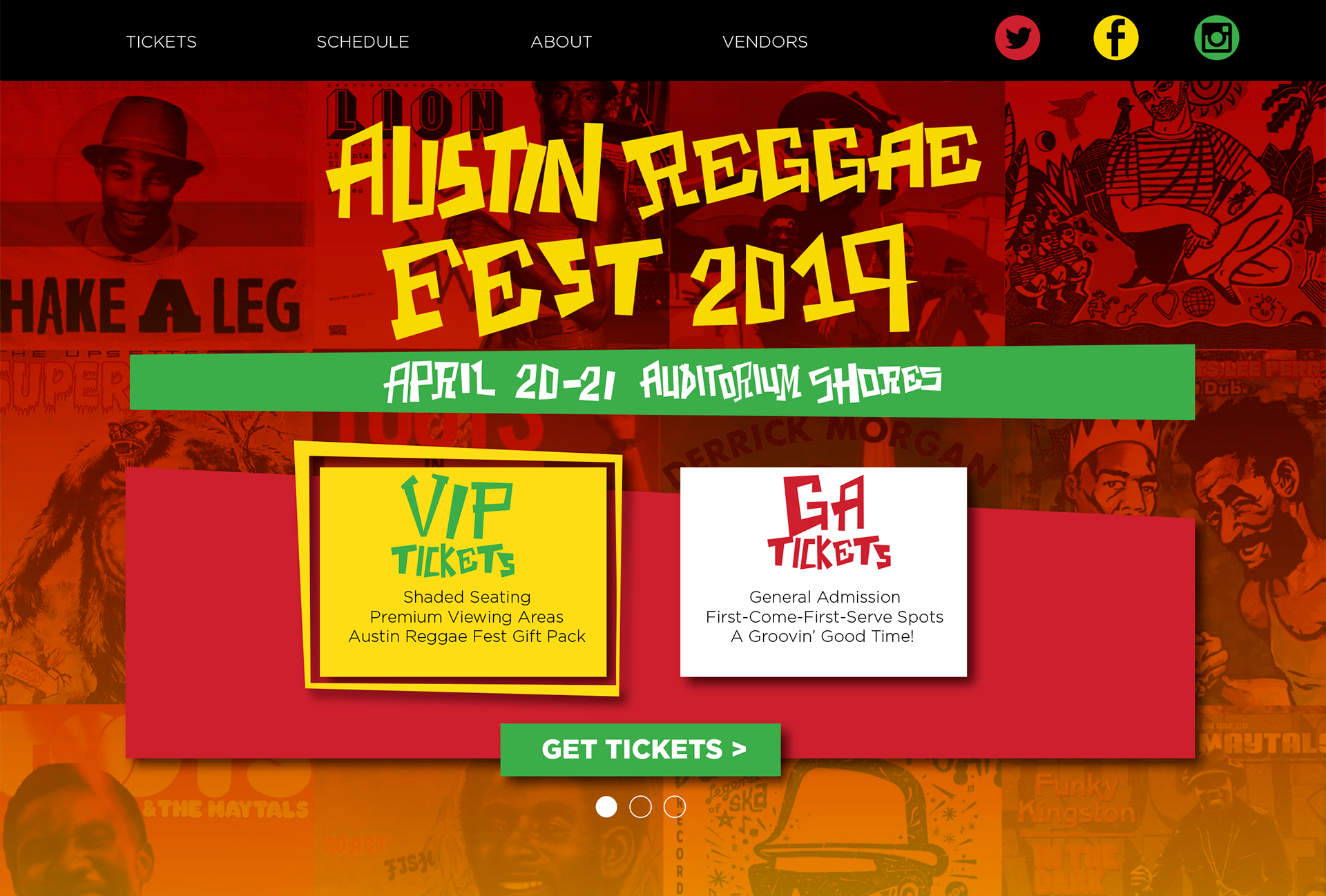
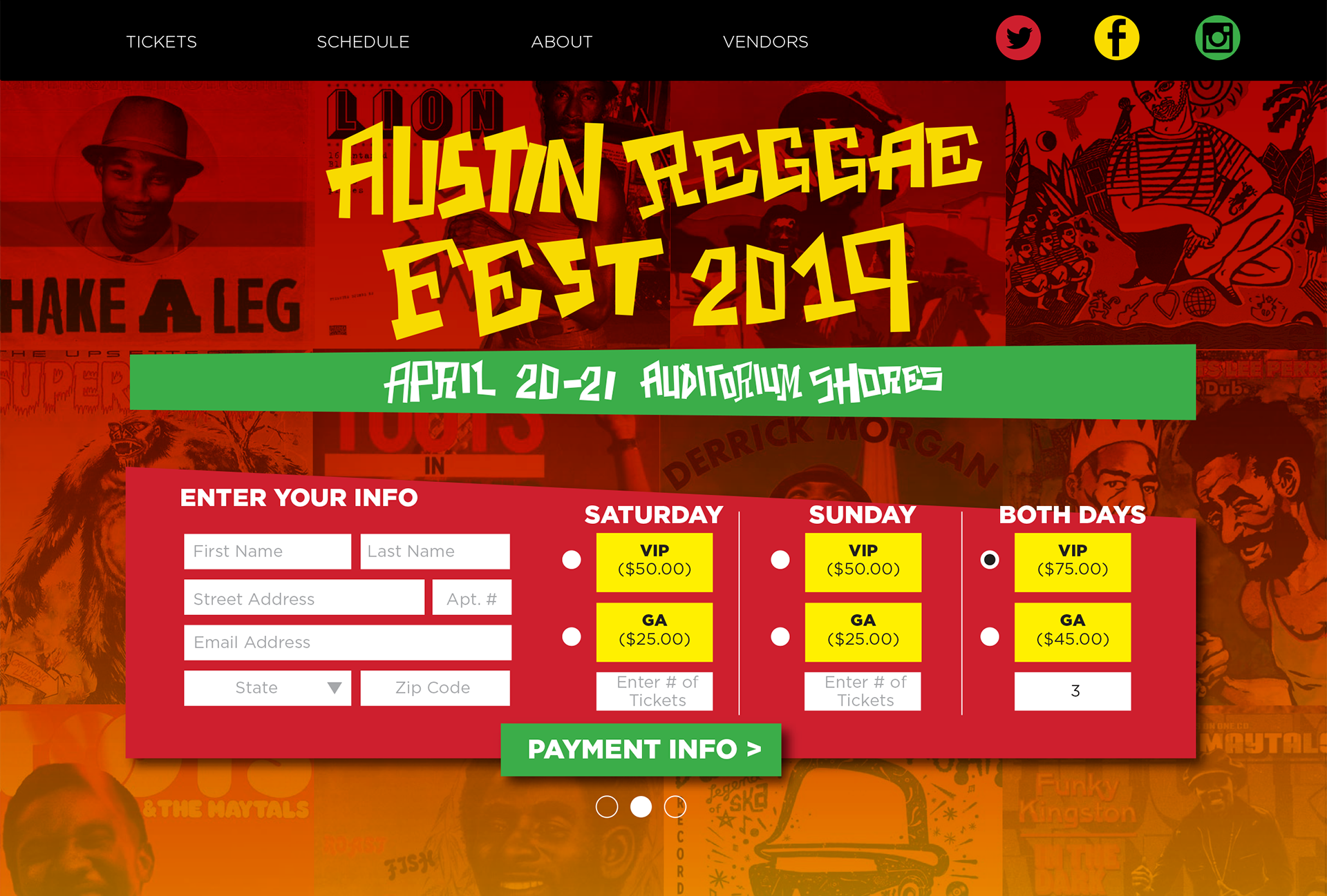
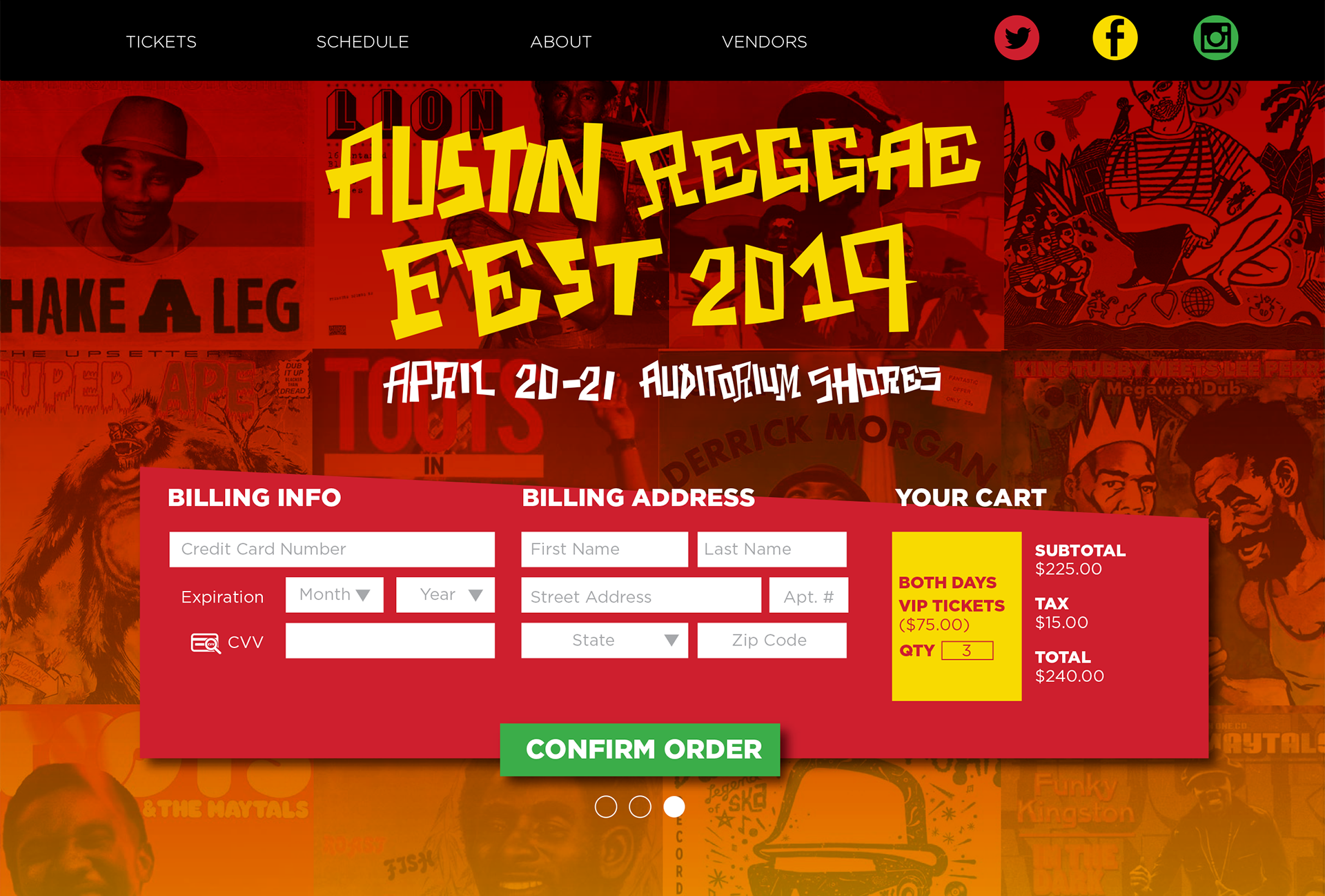
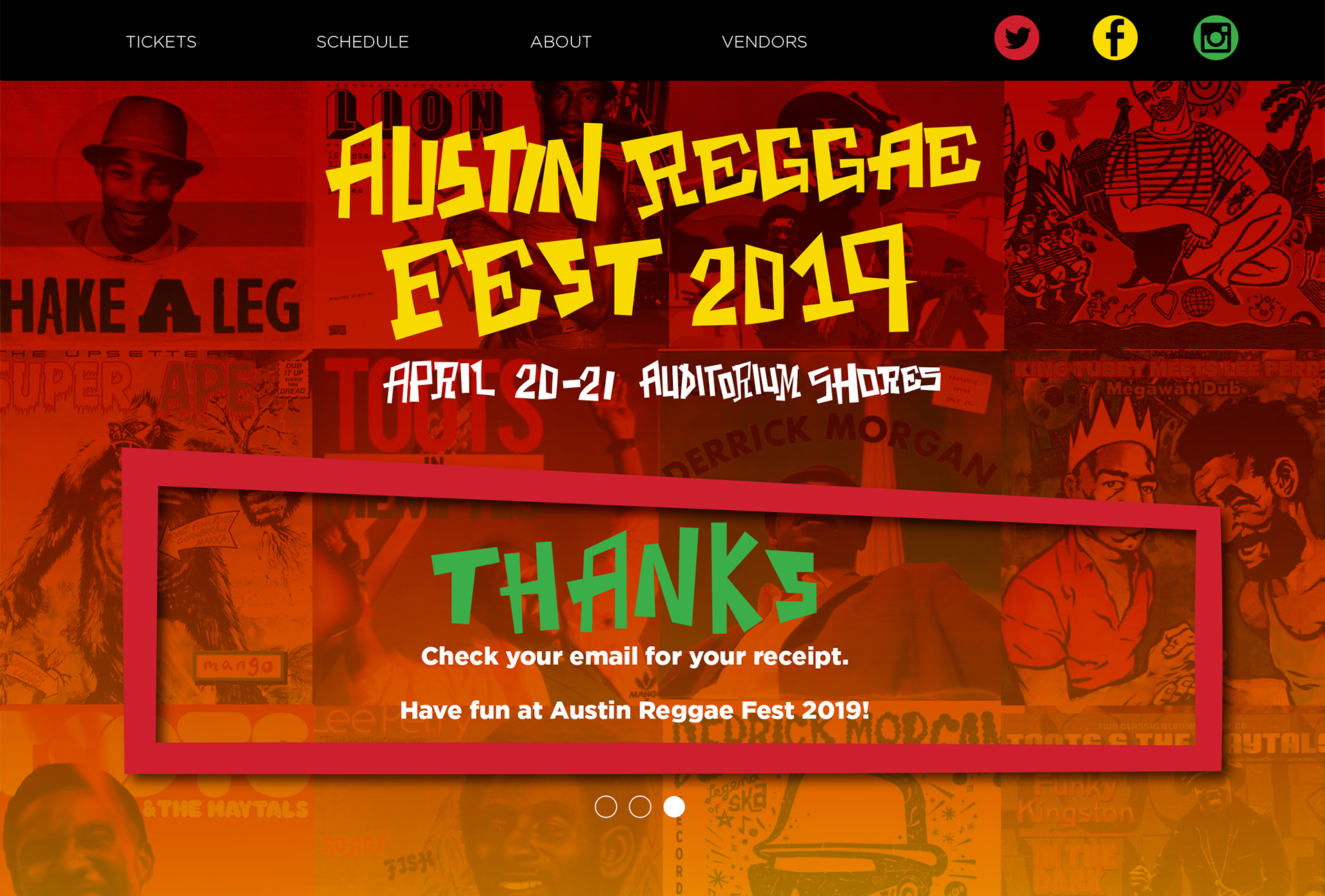
First and foremost, I wanted to make the ordering process easy for the customer.
I designed the above screens so the customer could purchase tickets to the event easily,
without having to scroll or visit another page.
without having to scroll or visit another page.
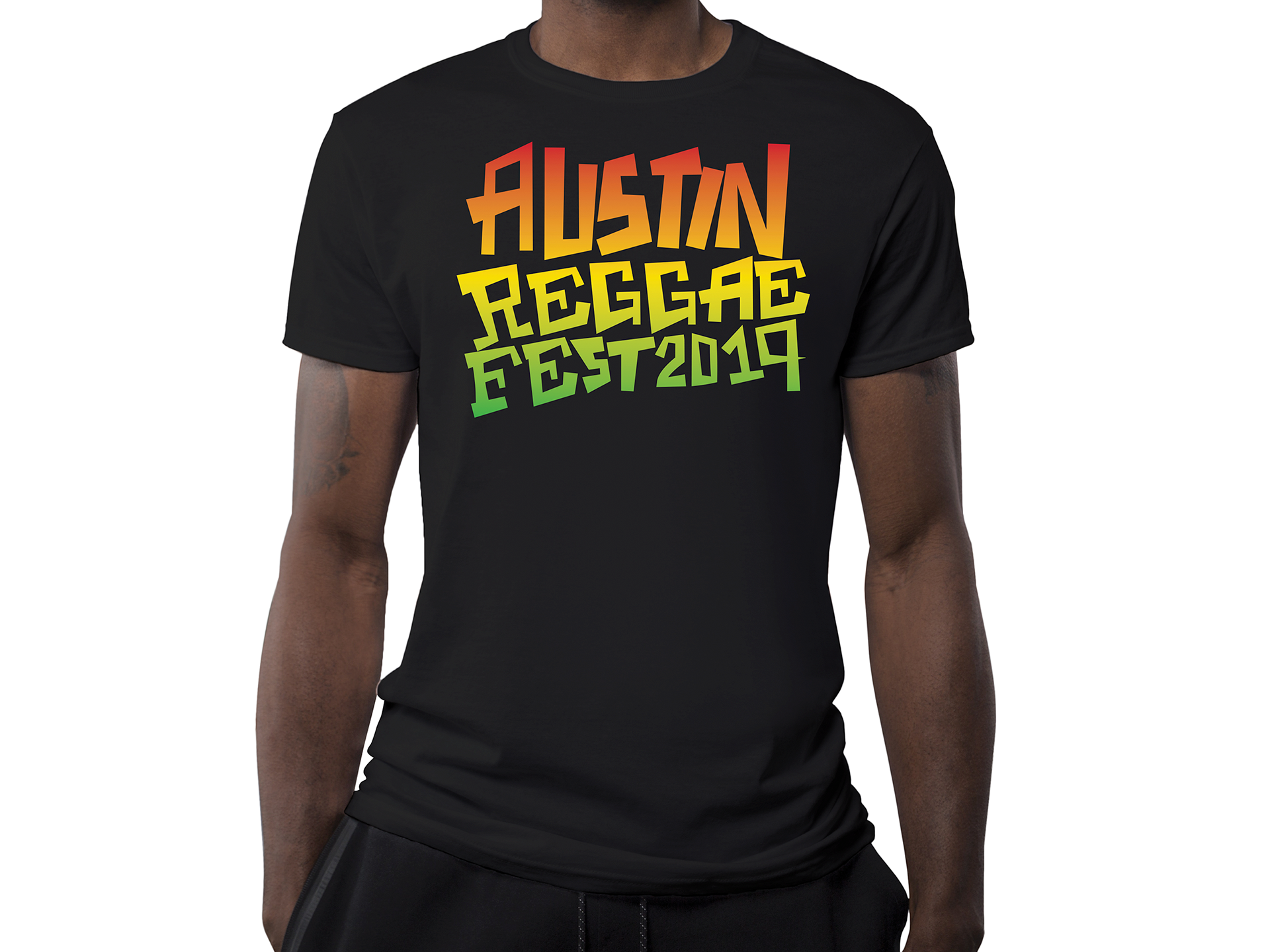
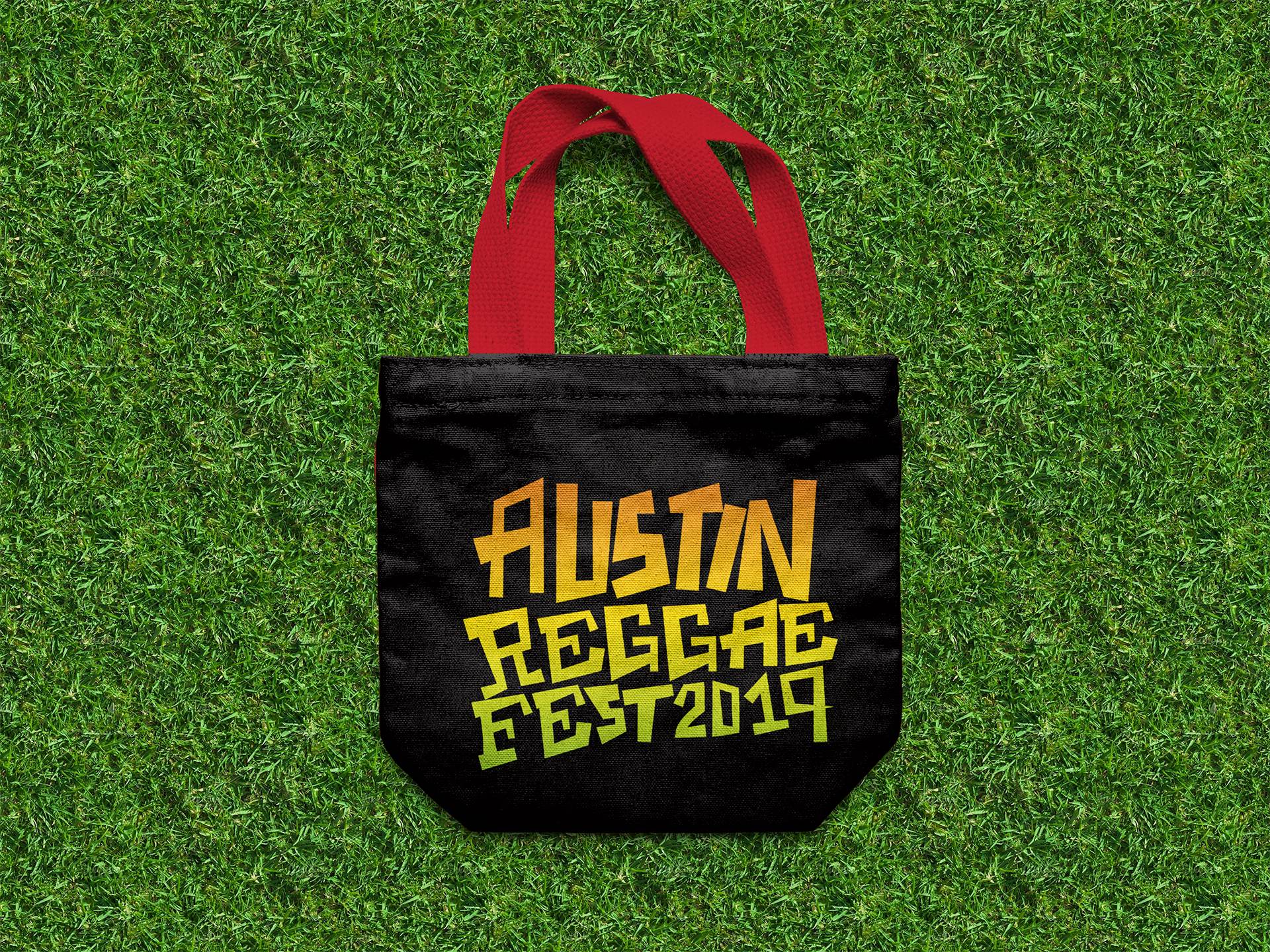
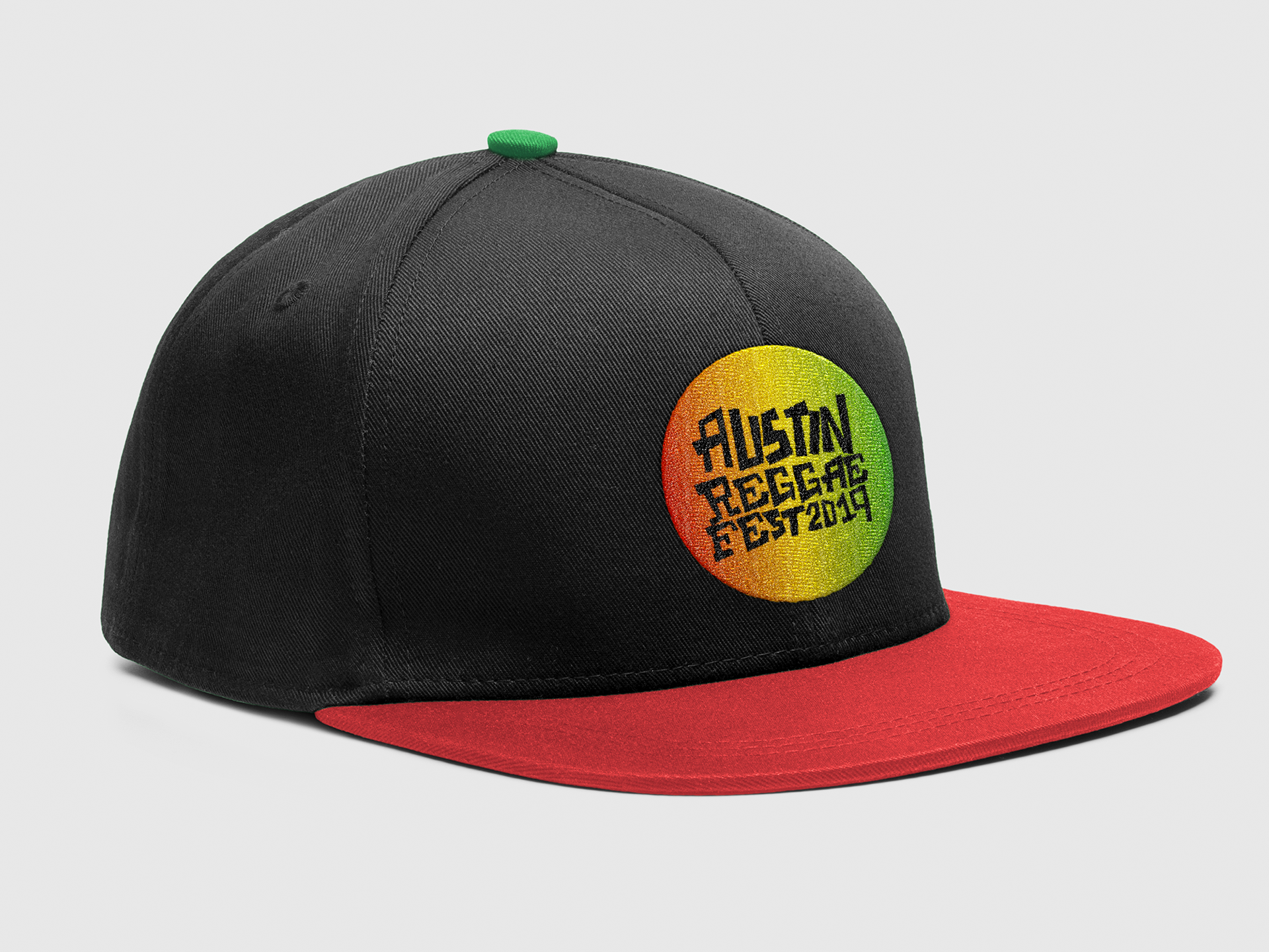
For the branded items, I wanted to keep it simple.
I gave the logo a split fountain color look. It gives the items a retro feel.
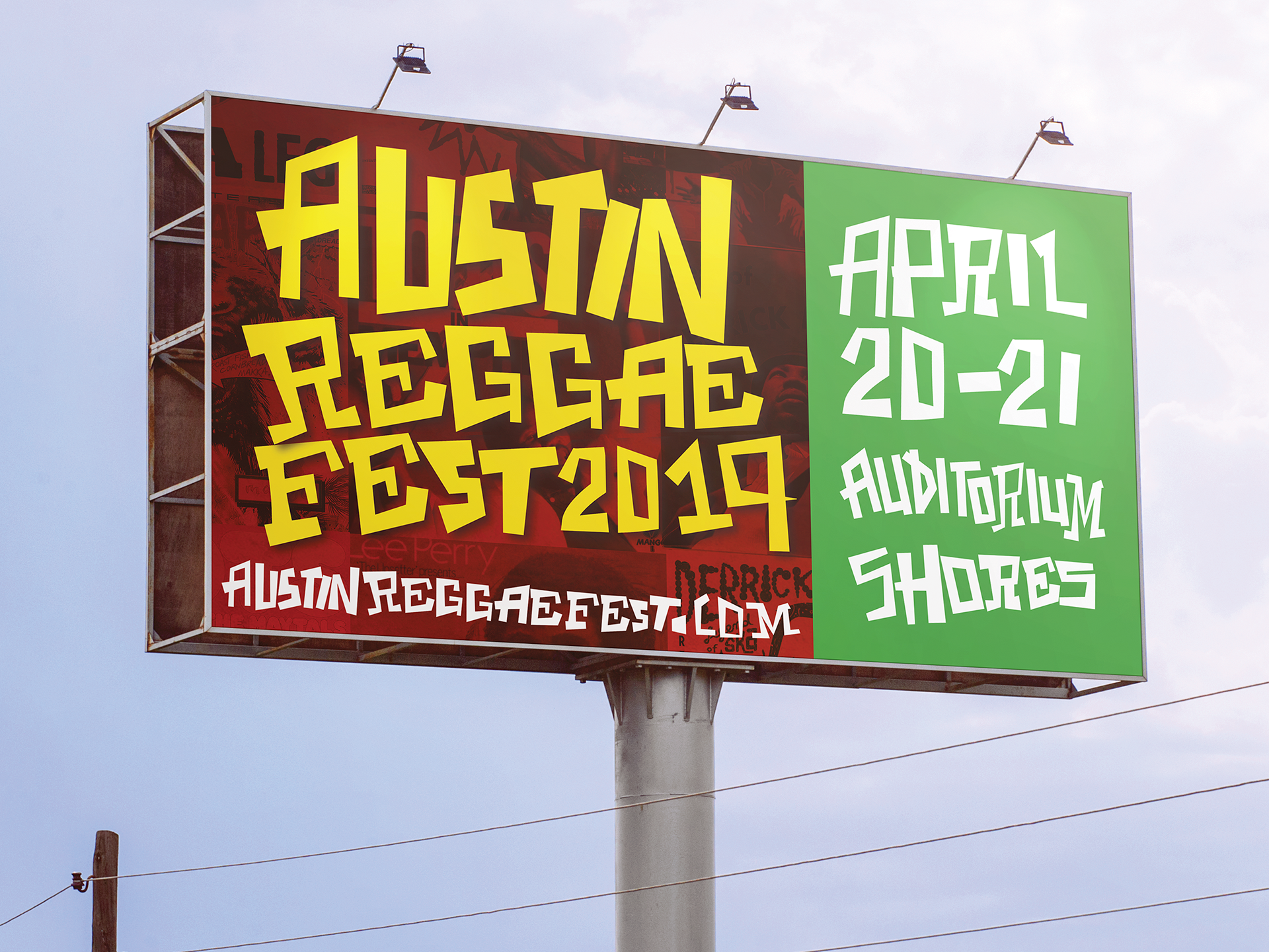
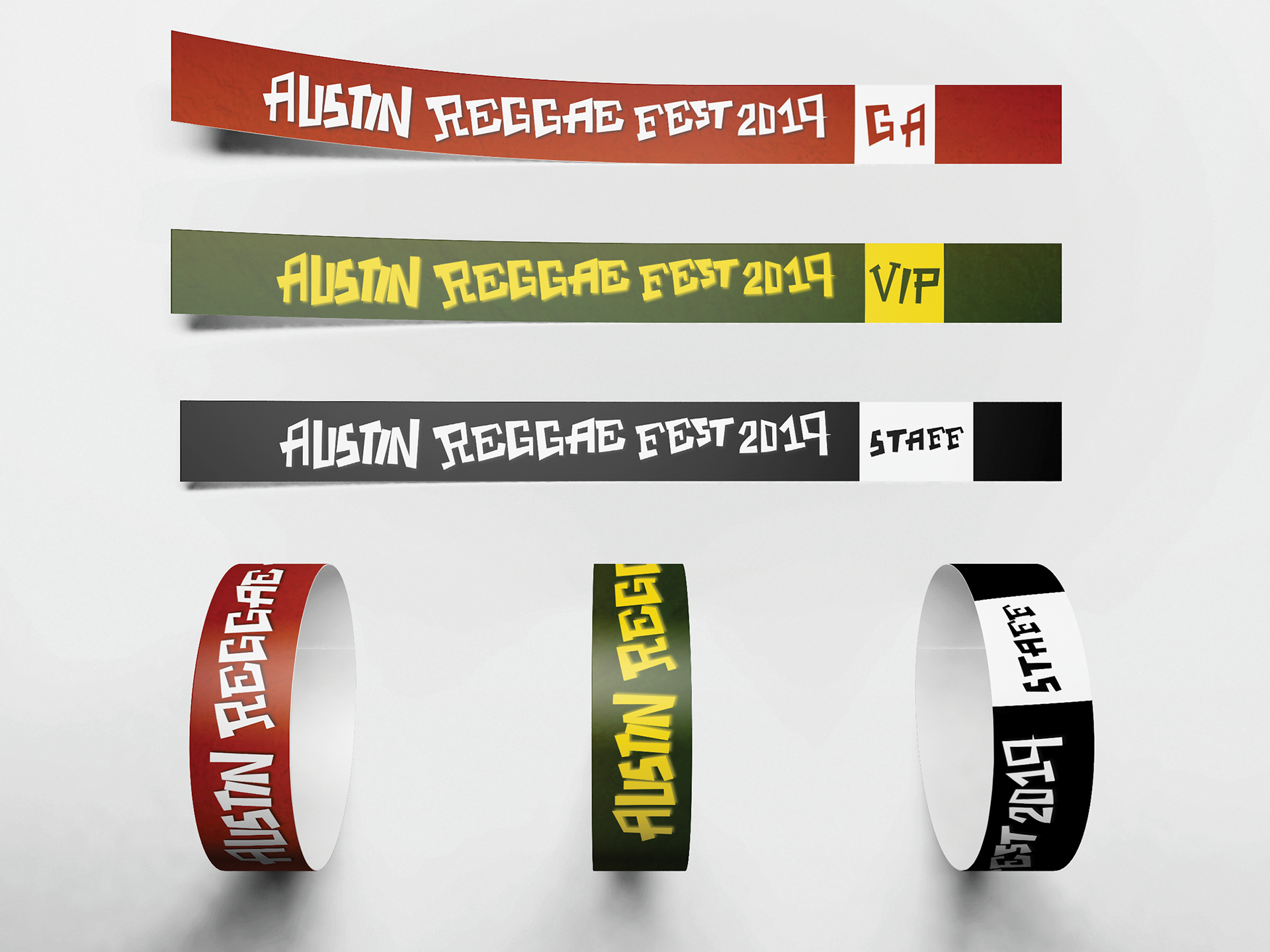
The design was definitely a success because I was able to line up the information
in different orientations while still maintaining a consistent brand identity.
in different orientations while still maintaining a consistent brand identity.

